I created this poster as an exercise in experimental data design. I tend to focus on function, and in this project, I wanted to push myself out of my comfort zone by prioritizing the spectacle.
My goal was to visualize data sets about climate change by following the principles of data humanism. I wanted to 1) engage the reader with striking imagery, and then 2) provide them with the details and context they need to dig deeper.
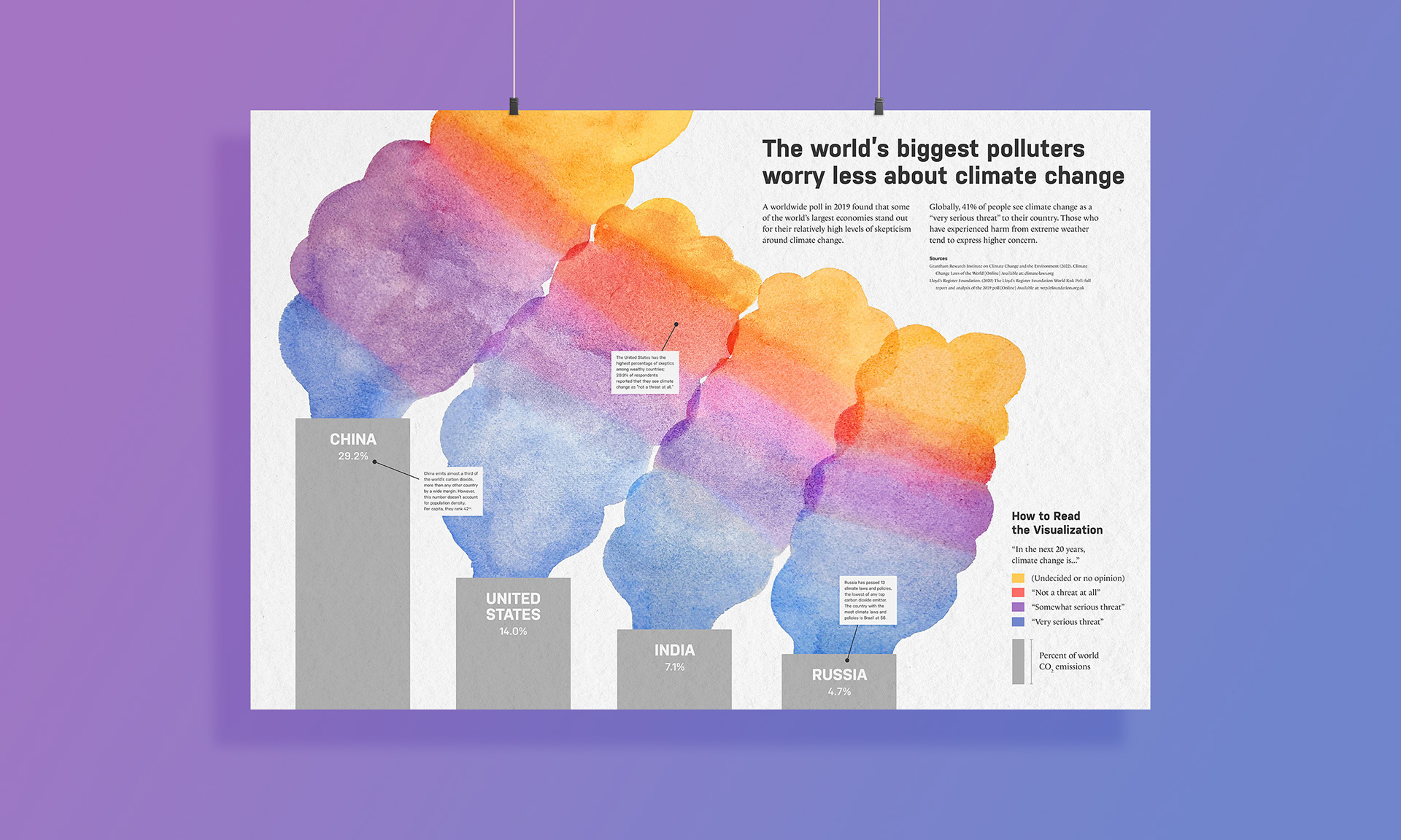
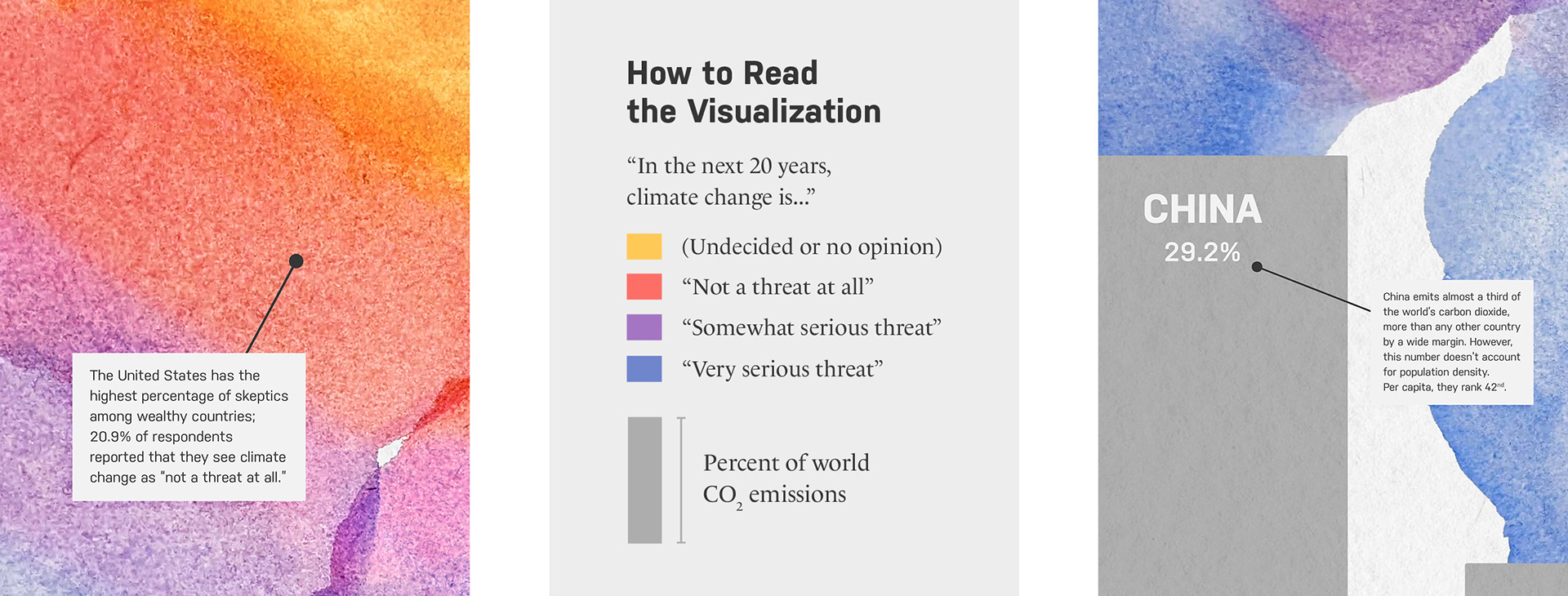
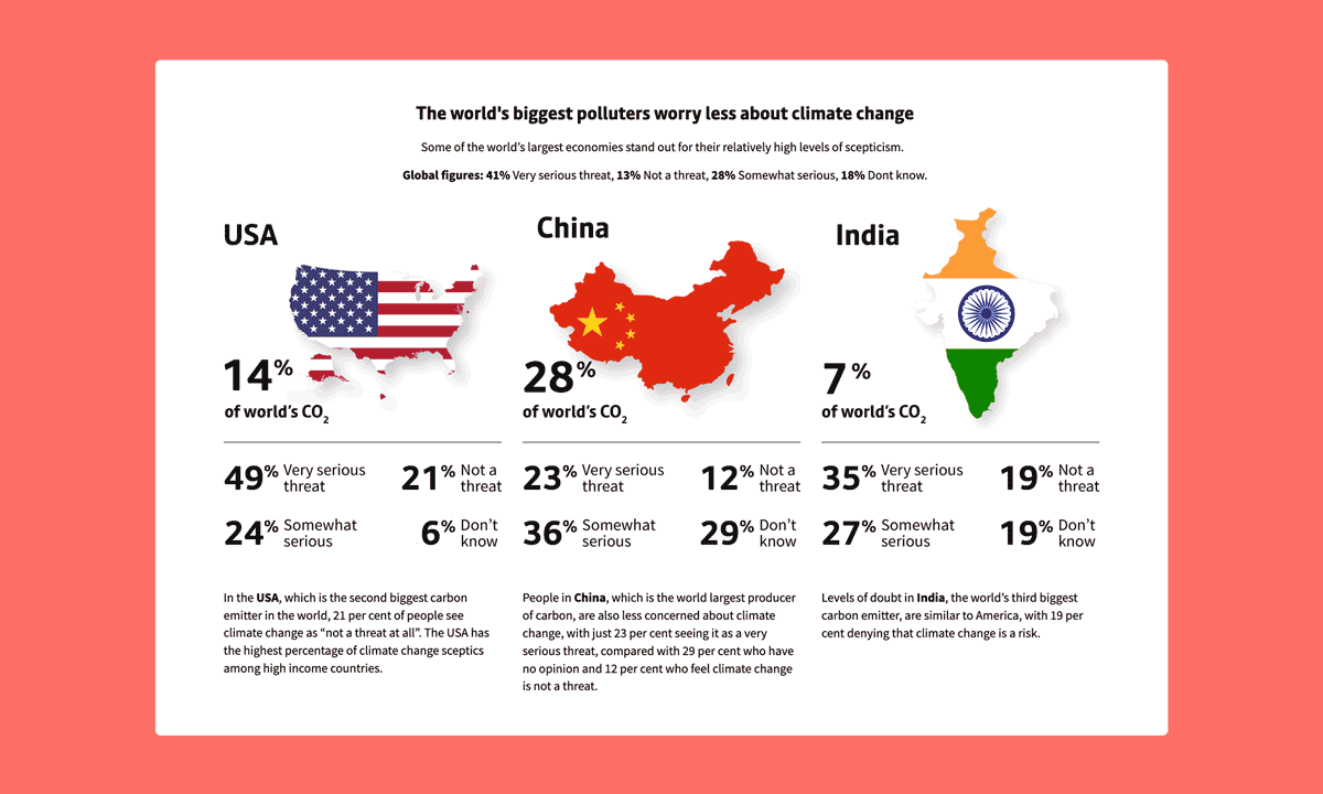
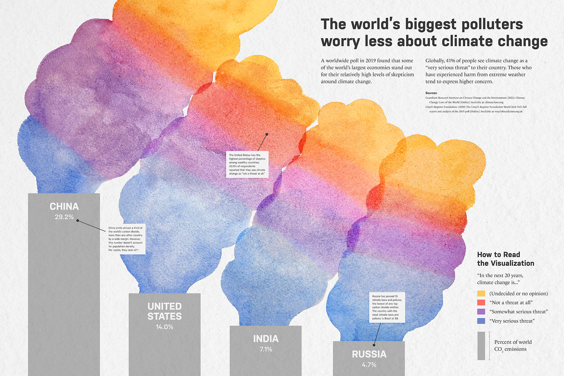
I was inspired by the climate change section of the World Risk Poll, which is the "first global study of worry and risk across the world." When assembling the poster, I borrowed some of the written content (including the headline) from the original report.
Brainstorm & Sketching
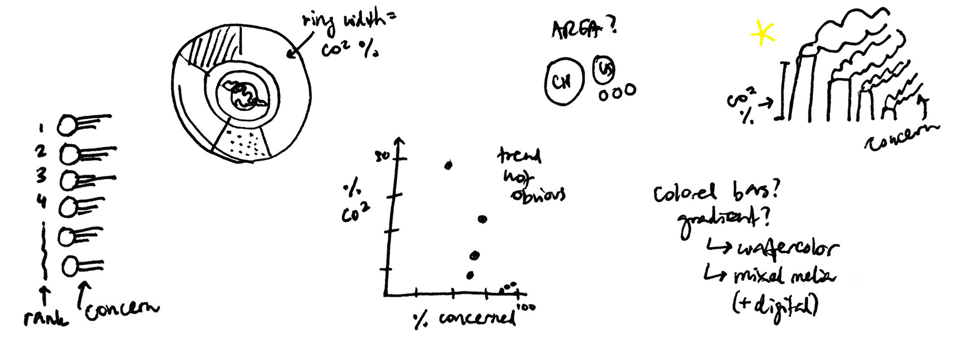
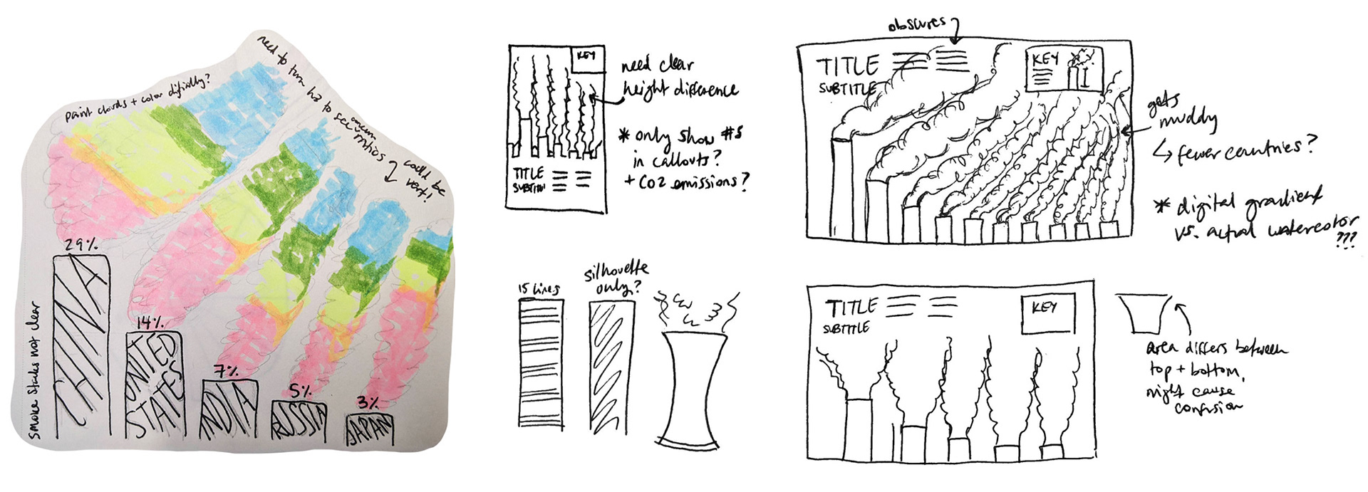
I tried out several different methods of organizing data before I settled on the smoke stack design. It's a little on the nose, but it conveys the topic of the data immediately and provides many paths for interesting compositions.
Next, I did another round of sketching to find the poster's overall structure. I centered the smoke as much as possible to make full use of the eye-catching colors and mixed media.
Creating the Poster
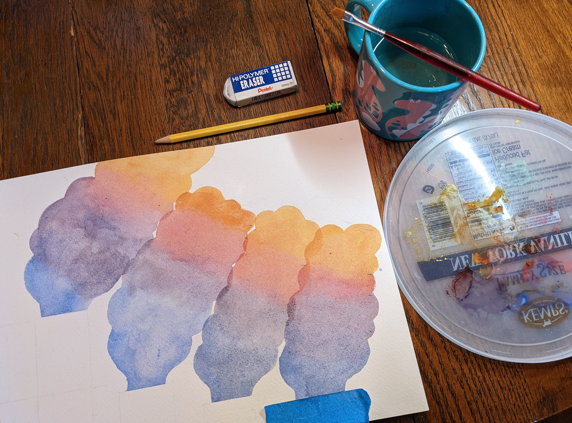

After creating a rough sketch on paper, I had some fun with watercolors and took the final painting into Photoshop. Then, using a lot of adjustment layers and feathered masks, I distinguished the colors as much as I could while maintaining the naturally painted style.
The final design includes digitally-drawn smoke stacks and a smattering of text, which provide context and clarifying information for the reader.
Background texture sourced from Unsplash